

The countdown to the 2016 college football season has started, but before we start getting too caught up in the promising upcoming season let’s take a look at some stats from the past few years. All stats are courtesy of www.footballoutsiders.com. Italicized text is taken directly from the site as a reference to better describe the metrics.
The S&P+ Ratings are a college football ratings system derived from the play-by-play and drive data of all 800+ of a season’s FBS college football games (and 140,000+ plays).
The components for S&P+ reflect opponent-adjusted components of four of what Bill Connelly has deemed the Five Factors of college football: efficiency, explosiveness, field position, and finishing drives. (A fifth factor, turnovers, is informed marginally by sack rates, the only quality-based statistic that has a consistent relationship with turnover margins.)
- Second-Order Wins (2ndO Wins): Second-order wins compare the advanced statistical components of a given game, and the single-game win expectancy they create, to the actual results of the game. This projected win total is a cousin of the Pythagorean record, a concept common in many sports. They are presented below, with the difference between a team’s wins and second-order wins in parentheses.
- S&P+ rating: Using the five-factors concept above, the S&P+ ratings take into account efficiency (Success Rates), explosiveness (IsoPPP), and factors related to field position and finishing drives. It is now presented in two forms: the first is a percentile, and the second is an adjusted scoring margin specific for this specific season’s scoring curve.
- Off. S&P+ rating: A team’s offense-specific S&P+ rating, presented in the form of an adjusted scoring average.
- Def. S&P+ rating: A team’s defense-specific S&P+ rating, presented in the form of an adjusted scoring average (and since this is defense, the lower the average, the better).
- Strength of Schedule rating (SOS): A simple schedule measure based on average S&P+ ratings and normal distributions.
- Weighted S&P+ rating: This is an attempt to measure how a team was playing at the end of a given season, with extra weight given to the most recent games. It is limited in power by small sample sizes, but it is useful in determining which teams finished strong and which derived most of their good (or bad) final ratings from early-season play.
Louisville 10 year S&P+ stats:
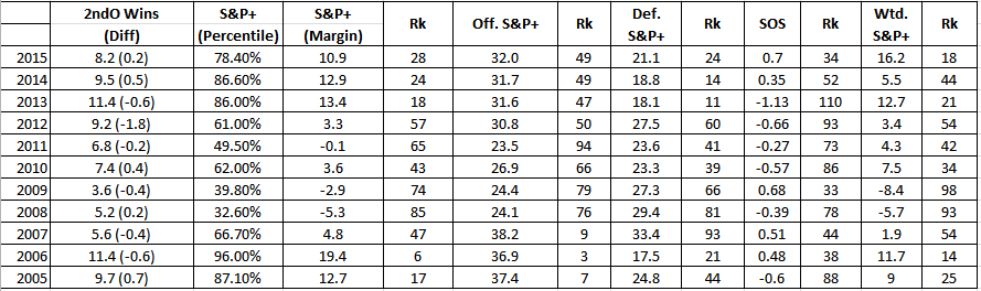
Note: A couple things to take a look at here. First and foremost, it is necessary to remember that these metrics take into account both efficiency as well as strength of schedule. These are the reasons why the offensive and defensive numbers are so similar to the 2013 team. I am fairly confident that if you put the 2013 and 2015 teams up in a head to head battle 2013 would come out on top, but I think it may be a little closer than one might imagine. One of the biggest things that stuck out while reviewing this data was the Weighted S&P+. Want a metric to get you excited about next year? That would be it. As described above, Weighted S&P+ is an attempt (with somewhat unknown/limited effectiveness) to tell how well a team was playing at an end of a season.
Offense:
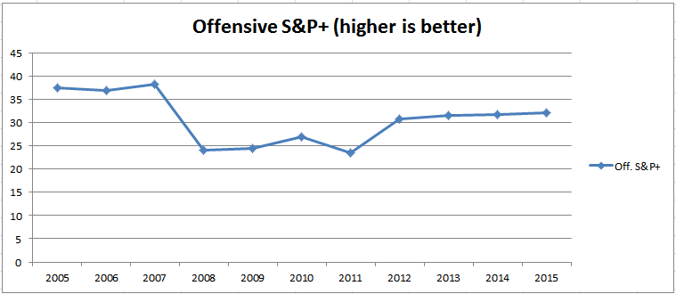
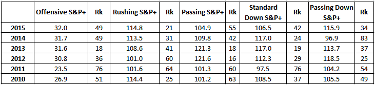
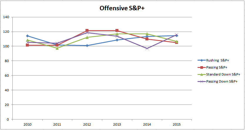
Note: It was fairly shocking to see that UofL’s overall offensive S&P+ rating was the best it has been since Petrino’s last stint at Louisville, even better than the 2012 & 2013 teams. Not only was the overall rating better but the rushing rating was also the best it has been in the past 6 six years. This is despite what most would consider a “sub-par” running game in 2015. Like it was mentioned above, this can be explained by the much improved schedule and much tougher defenses in the ACC.
Offensive Line:
Run-blocking stats
- Adjusted Line Yards: One of only two opponent-adjusted numbers on the page, this aligns with the ALY figure FO tracks for the NFL and is presented on a scale in which 100.0 is perfectly average, above 100 is good, below 100 is bad.
- Standard Downs Line Yards per Carry: The raw, unadjusted per-carry line yardage for a team on standard downs (first down, second-and-7 or fewer, third-and-4 or fewer, fourth-and-4 or fewer).
- Passing Downs Line Yards per Carry: The same unadjusted averages for rushing on passing downs.
- Opportunity Rate: The percentage of carries (when five yards are available) that gain at least five yards, i.e. the percentage of carries in which the line does its job, so to speak.
- Power Success Rate: Percentage of runs on third or fourth down, two yards or less to go, that achieved a first down or touchdown.
- Stuff Rate: Percentage of carries by running backs that are stopped at or before the line of scrimmage.
Pass-blocking stats
- Adjusted Sack Rate: An opponent-adjusted version of a team’s sack rate — sacks divided by (sacks plus passes), presented on a scale in which 100 is perfectly average, above 100 is good, below 100 is bad.
- Standard Downs Sack Rate: Unadjusted sack rate for standard downs pass attempts.
- Passing Downs Sack Rate: Unadjusted sack rate for passing downs pass attempts.
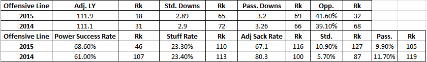
Note: This was the most interesting data to look at in regards to the last couple years for me. On one hand, adjusted line yards and opportunity rate are two metrics that show that the offensive line could perform well when it didn’t completely breakdown (see stuff rate, adjusted sack rate, and standard/passing downs sack rate). Obviously, this is caused by a lot of by a lot of youth along the offensive line in 2015. One stat that was nice to see a big improvement on was the power success rate. From 2014 to 2015, UofL improved by over 7% in a stat described as “Percentage of runs on third or fourth down, two yards or less to go, that achieved a first down or touchdown”.
Chris Person
Latest posts by Chris Person (see all)
- Analyzing Louisville’s 2017 Defensive Front Seven Recruiting Class - February 1, 2017
- 4-Star Offensive Lineman Mekhi Becton Commits To Louisville - February 1, 2017
- 3-Star Offensive Lineman Toryque Bateman Commits To Louisville - January 30, 2017